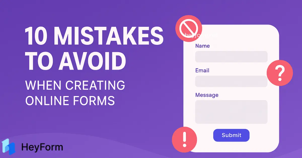
Common Mistakes to Avoid When Using Online Forms for Data Collection
Online forms are indispensable tools for gathering customer feedback, generating leads, and streamlining workflows. Platforms like Heyform simplify form creation, but even minor design flaws can lead to incomplete submissions, skewed data, or compliance risks. To help you maximize response rates and data accuracy, let’s explore the most common mistakes—and proven solutions to fix them.
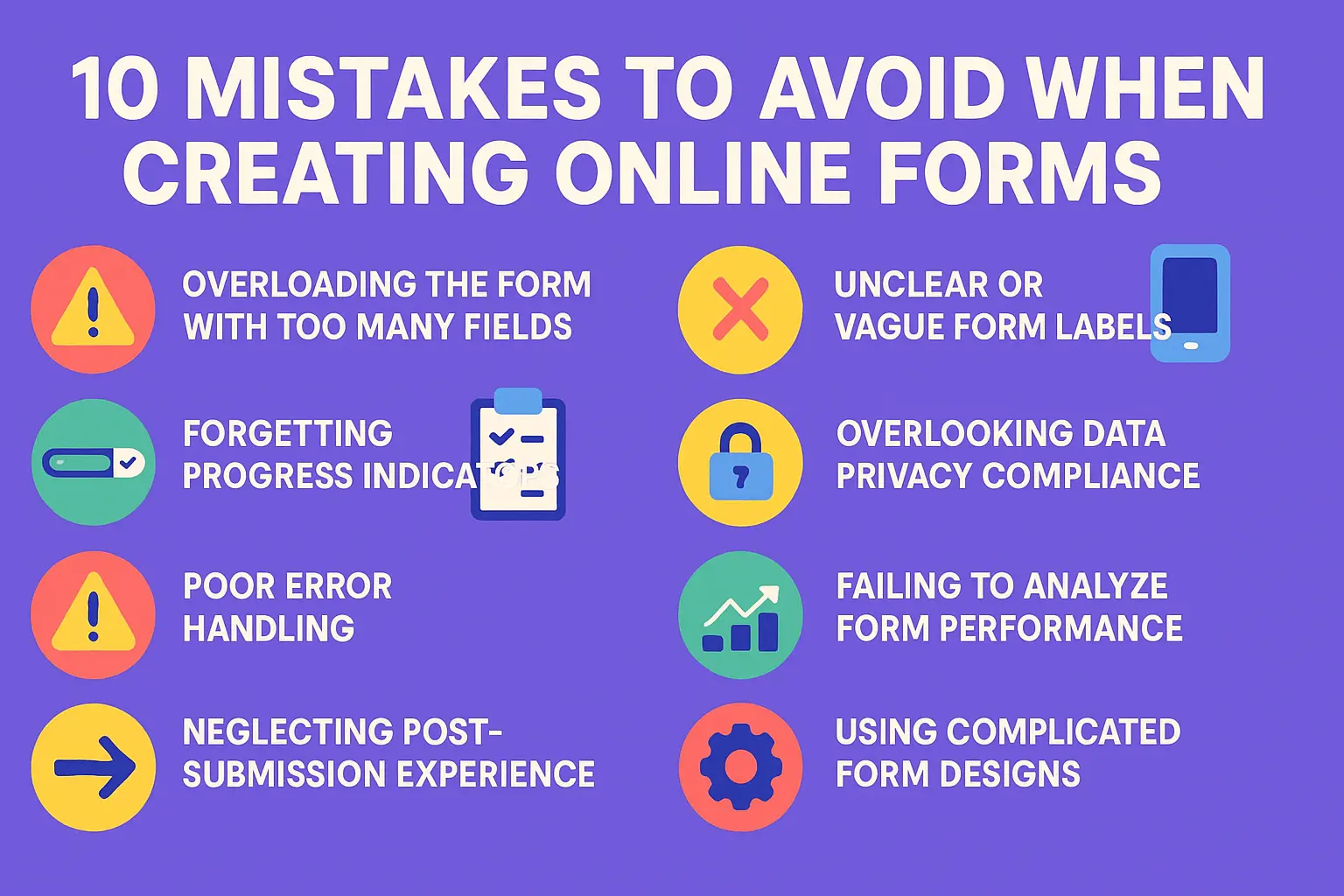
10 Mistakes to Avoid When Creating Online Forms
1. Overloading the Form with Too Many Fields
The #1 reason users abandon forms? Excessive length. A HubSpot study found that conversion rates drop by 50% when forms have more than 7 fields. While you might want to collect extensive data, overwhelming respondents backfire.
How to Simplify:
- Prioritize Essentials: Only ask for information critical to your goal (e.g., name, email, and one qualifying question for lead generation).
- Use Conditional Logic: With Heyform conditional logic, hide irrelevant fields. For example, hide “Company Name” if a user selects “Student” as their occupation.
- Break Into Pages: Split long forms into 3–4 steps with a progress bar.
2. Unclear or Vague Form Labels
Ambiguous labels like “Additional Details” confuse users, leading to errors or skipped fields. For instance, a label like “Phone” could mean work, home, or mobile numbers.
Clarity Fixes:
- Specify Context: Use labels like “Mobile Number (for SMS updates)”.
- Add Placeholder Text: Show examples (e.g., “DD/MM/YYYY” for date fields).
- Tooltips for Jargon: Explain terms like “CVV” with a hoverable info icon.
Bad vs. Good Label Example:
❌ “Address” → ✅ “Shipping Address (Street, City, ZIP Code)”
3. Ignoring Mobile Optimization
Over 85% of global internet users access content via mobile (Statista), yet many forms fail mobile users with cramped layouts or unclickable buttons.
Mobile Optimization Checklist:
- Test on iOS and Android using Google’s Mobile-Friendly Test.
- Use large, thumb-friendly buttons (minimum 48x48 pixels).
- Enable Heyform.net’s responsive templates that auto-adjust to screen sizes.

4. Forgetting Progress Indicators
Multi-step forms without progress bars leave users wondering, “How much longer?” Uncertainty increases abandonment.
Progress Tracking Best Practices:
- Show a numbered progress bar (e.g., “Step 2 of 4”).
- Use visual cues like checkmarks for completed steps.
- Keep pages short (3–5 fields per step).
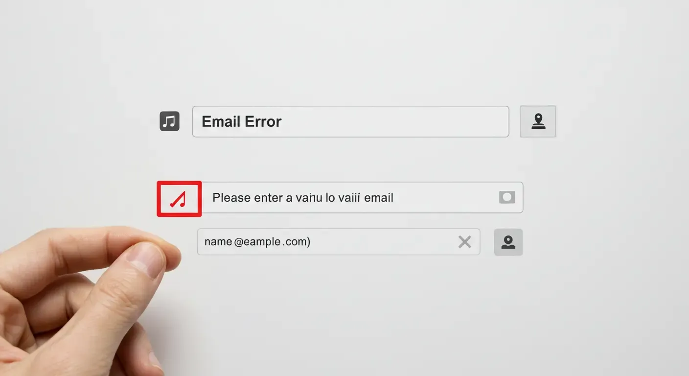
5. Poor Error Handling
Vague error messages like “Invalid input” frustrate users. A Baymard Institute report shows that 72% of users won’t submit a form after encountering errors if they’re not clearly explained.
Error Handling Solutions:
- Inline Validation: Highlight real-time errors (e.g., “Password needs 8+ characters”).
- Specific Guidance: Instead of “Invalid email,” say, “Please use a valid email (e.g., [email protected])”.
- Color Contrast: Use red for errors, but ensure readability for color-blind users.
Heyform’s validation rules let you set custom error messages and mandatory fields.
6. Not Testing the Form Before Launch
A broken “Submit” button or a dead-end page can ruin your campaign. Always test!
Pre-Launch Testing Checklist:
- Functionality: Test all buttons, links, and redirects.
- Compatibility: Check performance on Chrome, Safari, Firefox, and Edge.
- Load Speed: Use GTmetrix to ensure forms load in under 3 seconds.
7. Overlooking Data Privacy Compliance
Non-compliance with GDPR, CCPA, or HIPAA can lead to hefty fines. For example, GDPR violations can cost up to €20 million or 4% of global revenue.
Compliance Must-Dos:
- Add a checkbox for explicit consent (e.g., “I agree to the Privacy Policy”).
- Link to your privacy policy near the submission buttons.
- Use Heyform’s SSL encryption and GDPR-friendly settings to secure data.
8. Failing to Analyze Form Performance
Without analytics, you’re flying blind. Track metrics to identify bottlenecks.
9. Neglecting Post-Submission Experience
A generic “Thank You” page is a missed opportunity. Use this moment to engage users further.
Post-Submission Best Practices:
- Add a redirect link to your website or promo page.
- Offer a discount code or downloadable resource.
- Set up automated email confirmations via Heyform’s integrations.
10. Using Complicated Form Designs
Cluttered layouts with too many colors, fonts, or images distract users.
Design Tips for Better UX:
- Stick to a single-column layout.
- Use contrasting colors for buttons (e.g., green for “Submit”).
- Leave ample white space between fields.
Final Thoughts
A well-designed form balances brevity, clarity, and functionality. By avoiding these pitfalls and leveraging Heyform’s intuitive features—like conditional logic, mobile optimization, and GDPR compliance—you’ll create forms users want to complete.
Next Steps:
- Audit existing forms using this checklist.
- Explore Heyform’s template library for inspiration.
- Run A/B tests to compare performance.
For more tips, read our guide: 10 Smart Ways Businesses Use Online Forms to Boost Productivity.
By addressing these mistakes, you’ll turn form frustration into seamless data collection. Happy form building!